


Background: Throughout its history the Nazi Party relied heavily on posters as a form of propaganda. This page includes translations of parts of a Nazi book on posters intended for party propagandists. It was not available in bookstores, but rather was supplied to party offices and propagandists only. It was intended as the first of a series of treatises on propaganda from the party’s central propaganda office (Reichspropagandaleitung), but the outbreak of the war also made it the last.
This page outlines the book, and provides a full translation of what I think is the most interesting chapter: an analysis of good and bad posters. Many of the posters in the book are available elsewhere on the GPA. A visitor to the site provided me with a full translation of the book.
The source: Erwin Schockel, Das politische Plakat. Eine psychologische Betrachtung (Munich, Eher, 1938). A scanned copy of the book is available at archiv.org.
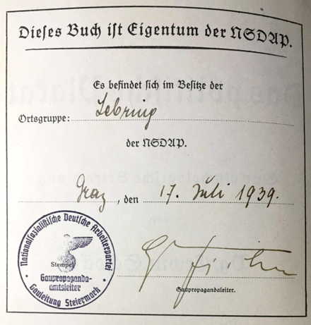
of a series issued by the Reichspropagandaleitung of the NSDAP.
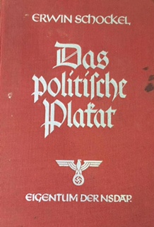 With this book by party comrade Erwin Schockel, the Reichspropagandaleitung of the NSDAP begins a series of instructional books for the party’s propagandists. The series is intended exclusively for internal party use and remains the property of party offices.
This interesting and stimulating book by Schockel is well-suited to provide valuable information and conclusions about the nature of political posters and includes good advice for the future development of this essential method of party propaganda.
Hugo Fischer
Stabsleiter of the Reichspropagandaleitung of the NSDAP
Introduction
The poster has a particular task within the field of political propaganda. This task that it has almost always had in the modern era was not properly appreciated for a long time. We, however, must thank political poster for forcing a liberal and Marxist worldview to the ground and for the fact that National Socialism conquered the Reich.
There was a time in Germany when the political poster dominated the appearance of the street. Since its existence was almost taken-for-granted by us, we did not see it as an influential factor in political life.
We do not want to forget that it had a much greater role in Germany than in other countries, where it announced minor, and sometimes major, government ordinances. For us, however, the political poster was a method of fighting for power and a new worldview. It was able to be of assistance, but it may not be forgotten that it was not nearly as effective as the power of personality and the effect of the spoken word.
Through its constant presence on the streets, it had a major influence on the subconscious thinking of the masses. Through constant hammering of the party’s slogans, it forced the thinking of the masses to come back to reality and attend to problems that, given a certain laziness of the human spirit, would have taken much longer to come to the light of day. People were forced to see the political world that the interim-Reich of 1918 had given us. The forces of Reaction reminded Germans of “the good old days” before the great war. That reached only a certain small part of the population. Workers and working people, to whom Marxism had directed its voice for decades, were captivated by another party. This was the KPD [Communist Party], which wanted to force a non-German materialistic worldview on the people, promising a Soviet-Russian paradise on earth.
 Had there not been this constant influence, there would have been political stagnation that could never have led to a new order of things.
Only the National Socialist movement was able to give the people a new idea, to show them the way that led to Germany’s future, a future not of years, but rather of eternity. It gave us back faith that the German people had long lacked, and gave us the wisdom for the great tasks of Germans and Germanic peoples. National Socialism sees Germany once again as the heart of Europe. Our land has a mission given to it by fate itself.
The fundamental knowledge that the Führer and his followers had enabled them to see beyond political squabbling to greater goals than simply gaining a ministerial office. They were not interested in making politics on the streets, but rather worked from the beginning to give the people back the original form of its life will and to secure its existence for coming millennia.
The people’s soul had to be cleaned of all dross and foreign influences, returning it to its original form. This work shows how the political poster contributed to that task.
Chapter I: From Antiquity to the World War
Chapter II: War Propaganda
The chapter contains numerous examples of German and Allied propaganda posters from World War II. It concludes: ‘Whether more or less beautiful, good, artistic or moral: enemy posters were the better, for they were the more successful.” [p. 53]
Chapter III: Freikorps and Referendum Posters
Chapter IV: Domestic Development of Poster Propaganda between 1919 and 1933
Chapter V: Poster Propaganda by Various Political Parties
This is the longest chapter, nearly 100 pages. It looks at a range of posters from many parties.
Chapter VI: Good and Bad Posters [pp. 187-237].
This is to me the most interesting chapter.
It will always be risky to make a final judgment about the effectiveness of a poster. Each viewer can only make a subjective judgment, and it may be that a poster than makes no impression on one person can have a large impact on others. Someone may judge a poster solely on artistic grounds, although its value always depends entirely on its propaganda effect and it must be judged on that basis. Above all, each poster’s value depends on its persuasive and stirring message, and the strength with which it gets its idea across to the viewer. Only after that may one consider its artistic value. The ideal poster unites both factors into a whole. On the one hand, that requires an artist who possesses great technical ability. He must also, however, have an intimate relationship with his people and a feeling for its specific characteristics so that no foreign influences can corrupt him. These two factors are in themselves not enough for a good poster, much less one that is politically effective. Consider Hans Thoma, whose landscapes breathe deep German life and display wonderful humor. He displays a deep relationship with the people, but one cannot imagine him as a poster painter. There must be something else necessary.
That is gripping power! It is the result of the passion with which the artist represents his idea and produces a poster. Only faith and passion can produce such ability. If he is one with the idea that he believes in and is sworn to, great and full of life, he will have the fire, the enthusiasm, the clarity that will find expression in his work. That is particularly evident in political life. A person can only understand a political idea if it is part of his very nature. If this is true for the average man, how much more for the artist. His task and calling is, in the midst of everything else, to be the prophet of those crucial things that are lost to ordinary people in the midst of everyday life. Yet those spiritual currents form the face of an age and give it a name. More than any other man, the artist has the opportunity to turn his job into a calling. Depending on his nature, the artist produces that which is elevated and pure (in German art), or base, destructive, and sick (Marxist and Jewish). Then there is the ability to portray things with a certain humor that makes the enemy ridiculous, even gives him fatal blows. A successful poster is the result of artistic ability, passion for the cause being served, fighting force, caustic sharpness, and an awareness of the times.
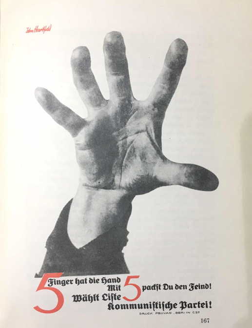
Given that, one should not be surprised if I include among successful posters the work of the Jew and former German citizen John Heartfield.
He who saw this disheveled and filthily-clad Jew and spoke with him had to realize, even if he knew little about Jewish physiognomy, that this ugly person could only create ugly and destructive work. This outcast of humanity, this prototype of Jewry, must always feel bound to those like him. Only there can he create something that seems good within the framework of the idea he serves.
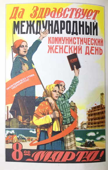
Herzfeld-Heartfield was one of the best KPD artists. His posters breathe the spirit of the KPD, the spirit of the depraved, of lower drives, of whipped up materialism. One is always shaken when one remembers that German workers, however incited, viewed this sort of person as a leader and prophet. Just as the Jew was never himself creative, but could produce “art” only through imitation, exploitation, and emotion, so it was with the Jew Heartfield. All of his posters, illustrations, etc., are photographs. He sometimes arranged them cleverly and added text. The two following posters display his emotional depth. The first shows typical Russian women in a layout and photo-montage that might be effective in the USSR. That does not concern us here. Rather, compare the faces with those of the second “German” poster by Heartfield. In both the faces and gestures are Slavic. In the first, a book titled Lenin is held up, in the second the hammer and sickle. The second poster may be appropriate to show the unity of workers and peasants by the Soviets, but it is thoroughly un-German.
The same is true of the poster used only in Russia on the fifth anniversary of Lenin’s death, which is thoroughly Jewish.
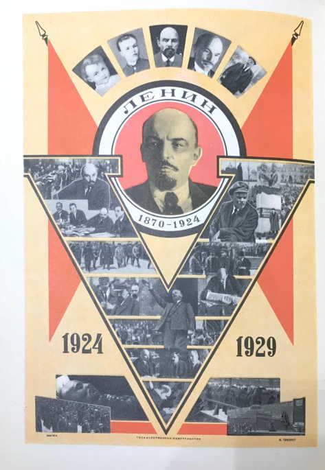
It is a form of ritual sorrow, a gravestone in paper, showing the life of the deceased from cradle to grave. From the Jewish perspective it is a good poster.
Not, however, for us.
A good poster should and must be a call to action.
If one wants to call on the spirit of a great person, one has the obligation to show the people the path that it must follow, to give it the courage and spirit to solve a task that it perhaps would not be able to accomplish without a great model. This poster only reminds the masses what they have lost, painting the loss in every shade, and thereby causing grief in every heart. That is a typical Jewish type of ceremony that neither consoles nor appeals those left behind.
Such an appeal is lacking here, so a memorial page would be better.
The KPD not only got its thinking from the Jewish Soviet state, but also all of its slogans and the like, which it then used with little alteration in Germany.
The following poster is from the Russian journal Kunst (from 1931).
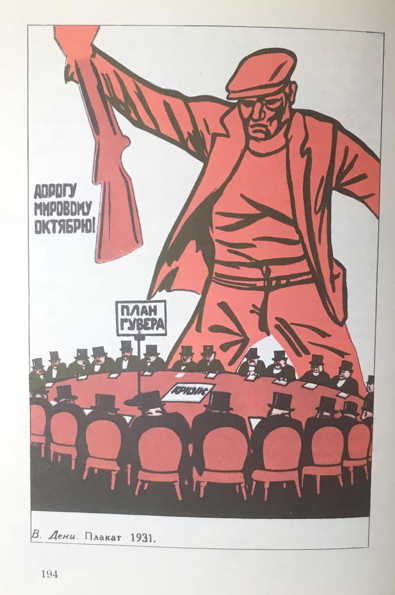
The next one is a “German” poster used in the Reichstag election of July 1932.
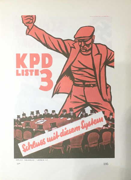
The propaganda department of the KPD had easy work. Instead of the original text “Make room for World October,” they wrote “Down with the System!” The table no longer had “crisis,” but rather “emergency decree” on the agenda. One thought he had done his duty to make propaganda in Germany by replacing bourgeois faces with those of leading German politicians. One did take the weapon away from the man, since the time did not seem ripe to reveal the revolutionary plans of the central executive office. Interestingly enough, there is from the German side a National Socialist poster with purely German content. The idea of “pounding on the table” was floating about and Mjölnir found its most German and popular, and therefore most effective, presentation.
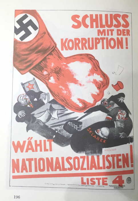
Looking at this poster, one easily sees what is wrong with the others. How weak, for example, are the words “KPD List 3!” in contrast to the fist, whose sleeve has no symbol. And look at that [Nazi] fist! It strikes the table like a sledge hammer, leaving the party bigwigs and scoundrels shaken with fear. Mjölnir is not satisfied with a threatening gesture. He is a National Socialist and accustomed to hitting so hard that the sparks fly, throwing the Marxist gang off their seats. And the swastika is clearly visible in the picture.
One NSDAP poster deserves particular notice, titled “One Man.”
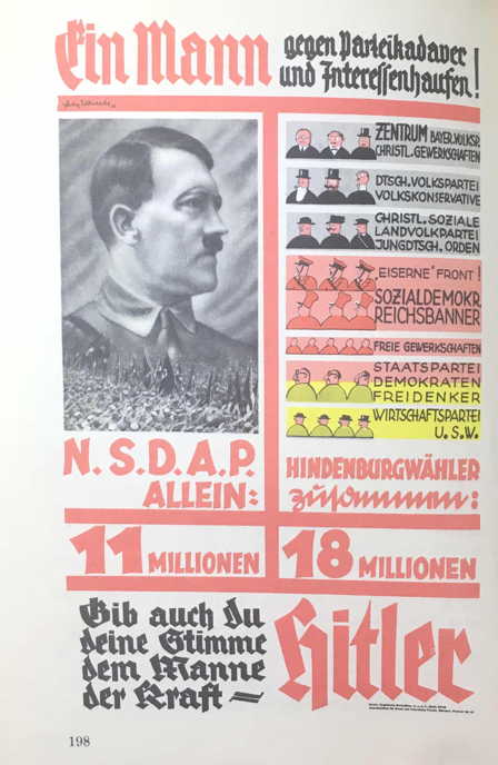
One can make the following observations. The layout is good, as is the arrangement of the text. The eye is first drawn to the picture of the Führer, which is good because it stands out amidst the many smaller images, and repeatedly forces the viewer’s eye back to it.
The content is also excellent, contrasting the “NSDAP alone = 11 million” with “Hindenburg voters together = 18 million.”
The call “Give your vote as well to the man of strength” is logical and compelling.
But there is a big catch.
The center of the entire picture, the Führer’s head, is simply impossible.
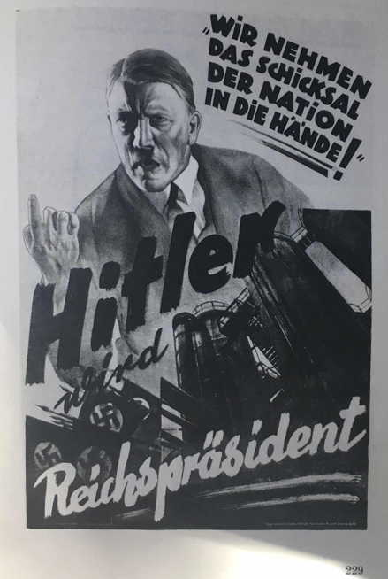
It is unclear if this is because of the photo, the retouching, or the printing. The result is something resembling a soft-focused image of an American film actor. The picture ruins the effect. “A man of strength” must look like the Führer does in the poster “We are taking the fate of the nation in our hands!” or in the poster showing him with Hindenburg: in short, the way the Führer actually looks.
The only explanation for this picture can only be that one was trying to appeal to women. Most women voters, as is known, are influenced more by superficialities.
It could be that an excellent poster like “We are taking the fate of the nation in our hands” was rejected by many women. They thought Hitler’s face was distorted and the poster looked too “communist.”
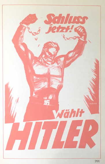
Two other posters than attracted attention, each in its own way, showed chains torn apart: the DVP [German People’s Party] poster with the verse “Only the German People’s Party can free us from Red chains!” and the NSDAP poster “Enough! Vote for Hitler!”
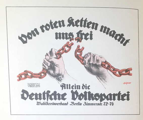
The first text was mockingly transformed into the phrase: “Only the leader Dingelbei can free you from the voters!”
The other poster shows the great difference better than words can. First, what about the two hands each holding a piece of chain? Without the text, no one could have any idea what the DVP poster meant. Mjölnir’s image had an entirely different impact. Each muscle, each tendon, one might almost say each drop of blood, breaths strength, an absolute will for freedom. The veins stand out like cords, the chest seems ready to burst, the face muscles are tight, the chin “grim” with exertion. The electorate here is not being appealed to with fine words to earn their favor, but rather shown the fighting, the effort that is necessary to gain victory and break the chains.
This poster is of particular value not only artistically, but also psychologically. It compellingly shows the coming battle and does not promise rich rewards and soft ministerial seats.
The leader of this battle is the man of the people. He embodies that part of the population fighting for freedom, as do Mjölnir and National Socialism in general. As a socialist movement, the NSDAP is interested in the well-being of the suppressed and enslaved. Once they are free, the power of class conflict thinking is broken and the way is clear to a united and powerful Germany, free from the foreign yoke.
One can also mention the impact a text can give to an image, as in the poster “Hitler becomes Reich President.”
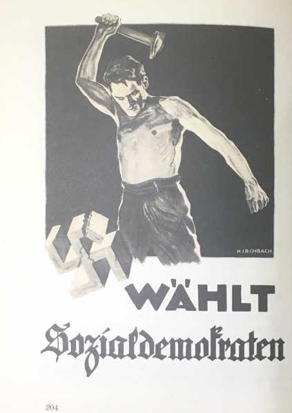
An SPD poster showing a “brown” worker smashing the “brown” swastika with a powerful blow is better than the DVP poster.
The Mjölnir poster “Against hunger and desperation! Vote for Hitler!” also embodies NSDAP thinking.
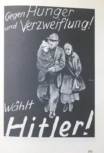
An everyday image is chosen, often overlooked, but here becoming a compelling image. Even those who still had jobs feared that they, too, might find themselves hopelessly wandering the streets with wife and child. The poster elicits fear. Some of the unemployed who were not yet aware of their desperate situation or who had accepted their situation as apparently unchangeable were shaken. This poster was powerful because it was close to reality. Every fifth person was already unemployed; who would be next? Once again a neighbor was asked, how long will we be able to pay the rent? No such individual fate had previously been shown. And yet! Underneath in bold letters is the phrase “Vote for Hitler!” It is more than an encouragement. It is hope, security, the only way to end the horror, showing a way out to millions of the desperate.
If one looked at the poster titled “Voters, King Frederick votes with you for List 6!” without knowing the circumstances, one would have doubts about good taste in advertising for the NS Freedom Movement. However, since Potsdam was reactionary since time immemorial, Frederick’s head was the only way to prepare the way for National Socialism without doing too much damage to the idea. And this was 1924, when it was impossible for a supporter of the NS-Movement to portray Hitler in a poster. Such a picture would have said nothing to the citizens of Potsdam. The citizens of his former palace city did associate the name of Frederick the Great with a certain view of the state. One thus reminded Potsdamers of the Great King who still had a certain influence on the Weimar Republic, making it clear that there was a political movement that had the same goals as were the aim of Frederick’s policies.
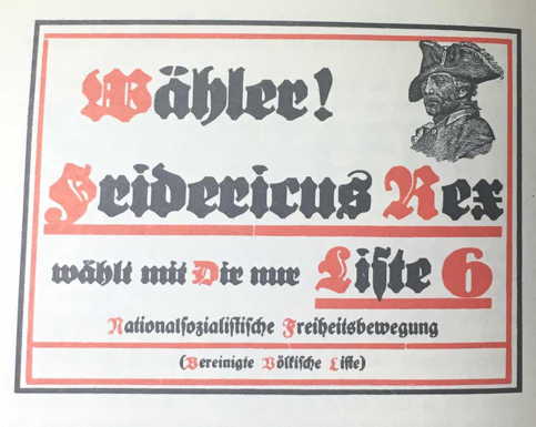
Frederick’s head meant the same to the Potsdamers as Hitler’s head on a black background later meant for us.
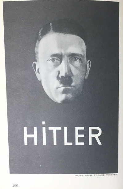
The impact of this poster, of course, is vastly greater. First, the outward impression is a harmonious whole. Peacefulness, strength, and goodness speak to the viewer from Hitler’s face. The impression of a spiritually pure man has to be good. And since the poster was printed in white over black, it attracted attention in the midst of the bright colors of poster pillars.
The NSDAP’s Bavarian posters form their own group:
“The achievements of the Revolution!”
“The Völkisch Bloc...”
“Down with Financial Slavery!”
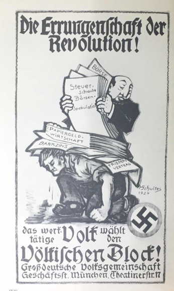
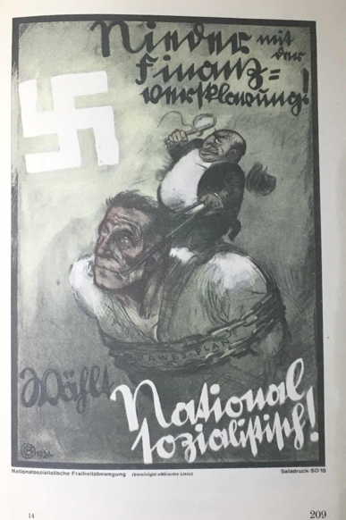
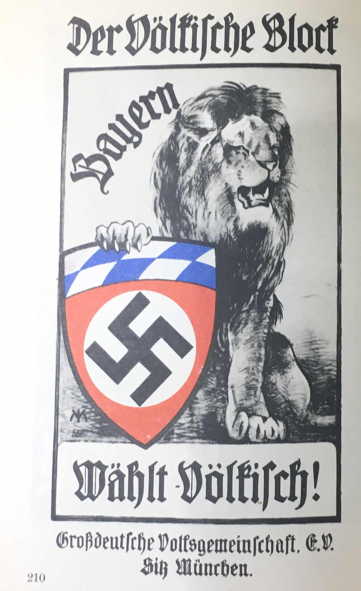
The first is entirely inadequate. The worker’s resigned patience as the Jew piles every higher burdens on him looks more sad than likely to incite fighting. The clenched fist is more for support than punching. The party symbol is small and obscure. And the Jew seems more likely a find citizen less interested in profit than in distributing the weight properly. The fundamental idea is good, but the artist probably lacked the necessary skill.
The Mjölnir-Schweitzer poster from the same year (“Down with Financial Slavery”) is substantially better from an artistic standpoint. The momentary fate is borne with clenched teeth, but there is a beam of hope in the future and the text is combative and therefore more effective. The poster “Bavaria votes völkisch” from the same period is notable for the two escutcheons alone.
One naturally may not forget the period from which these three posters come. The young NS movement was robbed of its Führer and dissolved into larger and smaller groups. Partly together, partly against each other, they attempted to at least preserve the idea from destruction. That had more of a defensive character, which is evident in the propaganda. At least these posters kept reminding the people that it lived under Jewish slavery.
The 1932 poster “Therefore vote for List 1” is also from Bavaria in 1932.
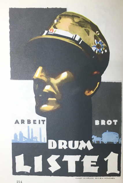
Here, too, as with the poster signed by Ritter von Epp, the word NSDAP is missing. In this case, however, the head of a Bavarian S.A. man replaces any other symbol. The overall composition is harmonious, but lacks energy. It perhaps reminds one of a poster encouraging people to remember the military ordinance section (Reichsfeldszeugmeisterei). This poster clearly shows how different propaganda is from advertising. The artist was undoubtedly good at advertising, but it takes more than artistic ability to create a political poster.
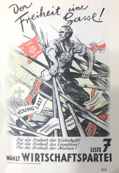
The difference between democracy (as understood by the Economic Party) and National Socialism is shown sharply and clearly in two posters that handle the same theme. First is a poster by Mjölnir. A National Socialist plunges into the enemy ranks with his own body. He opens the way to freedom with his body, his wounds, his death. He sacrifices himself, but his already closing eyes look prophetically into the Third Reich, and this vision gives his body the strength and his face the clear beauty that makes the whole poster so impressive and compelling. Every line of this fiery work speaks of energy and passion.
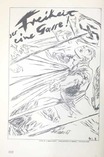
Then there is the “counterpoint”: “the would-be Winkelried” [a Swiss folk hero], produced by “?” (Mateyko?). This brave hero with the bib on his breast looks like he wants to say: “Well, what’s so funny here?” He carefully pushes the sharp spears away from his noble body. He looks over his shoulder to see if anyone else is coming, carelessly stomping the vegetables underneath with his noble foot. One could not provide a better image of the mentality of the German bourgeois, and it is even funnier since it was not intended to be so.
Next are four posters attempting to build popular enthusiasm for pacifism. Two are German, two French.
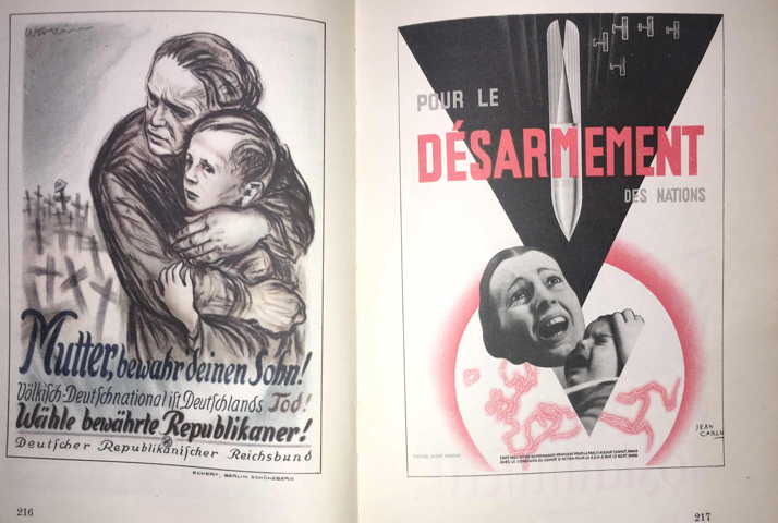
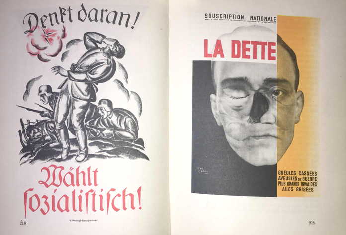
Both pairs have the same thought, but differ greatly in effectiveness. That is not simply because two use photographs, two drawings. (The previously discussed poster “Against hunger and desperation” shows how powerful drawings can be!). The effectiveness is much more in the fact that an individual fate is presented in a way that it is not generalized, but rather strikes each viewer with terrible force.
A comparison. Each day, thousands of animals are slaughtered in a big city. Everyone knows this and even statisticians and merchants are not particularly moved. It is much different when we are told the story of one animal that is somehow killed. The fate of the individual moves people’s thinking and feeling.
This peculiar fact is probably because the human brain usually does not have the ability to imagine large numbers of things. Since everything in life consists of thousands of tiny details that are perceived by the brain and formed into a whole, the slaughter of five hundred animals exceeds human perceptive capacity. It is impossible to imagine the individual fate, then multiply that many times. The mind ignores challenging things that exceed its ability to comprehend. And thinking is in general the activity to which we pay the least heed.
The modern press addresses this human weakness by transforming statistics hardly understandable to its readers into specific examples that can be understood, making them comprehensible and compelling. In the case of our example, one could say: If one laid the animals slaughtered each day in Berlin end-to-end, they would stretch for 60 kilometers, or the distance between Berlin and Brandenburg.
The French posters increase their effectiveness by omitting all distracting elements. The viewer’s eye is forced in the direction that the artist wishes. There is also limited use of color, which influences the overall effect.
Both French posters share another element that leads to important conclusions.
We have already seen that the French posters, like the German poster “Against hunger and desperation,” present a scene that is effective because one has understood how to appeal to the imagination without making heavy demands. The stage on which the scene transpires is so simple, so true-to-life, that it falls within the normal person’s imaginative abilities. The mind does not need to work to draw conclusions, but rather feelings are able to react independently. The thoughts that flow into us in daily life sink into our subconscious where they are brought together and organized. Negative thoughts are almost always somehow connected to a fear of what may be coming. During war, the risk of life plays a great role, especially in areas where war is being waged. In Germany between 1928 and 1933, there was the ghost of unemployment that paralyzed human consciousness. Fear of a thing is always worse than the thing itself.
If one wants to move a group of people to action, one must awaken in their subconscious an impression of immediate danger that can be averted by taking certain actions.
This is evident in the “Désarmement” and “Against hunger and desperation” posters, but not in the “La Dette” poster.
The latter had the great disadvantage of showing a catastrophe that has already occurred, which allows the viewer to think that it has not happened to him. People tend to avoid acting, finally doing so when it is too late. This is expressed in the proverb: “To lock the stable door after the horse has bolted.” One puts in locks only after a burglary. Before, one consoles himself with the thought that nothing has happened yet.
The same thing is true of the “La Dette” poster. Despite the fact that it is well laid out, it is nowhere near as successful as the “Désarement” poster.
The latter depicts a mother with her child, which immediately arouses more pity for their fate than for that of a man. The only important thing is that mother and child can still be rescued, which is not true in the case of the man. The first poster arouses active participation, the second only passive sympathy.
From what has been said, propaganda must present a vivid danger that arouses the feeling of being threatened. One must not only see the necessity of action, but the desire for self preservation must be appealed to in a way that overcomes all desire for comfort and motivates to immediate action.
Using an allegory in a political poster is not bad in itself, as they in general have a vivid effect and stimulate thinking. They were often used by the NSDAP and its press, particularly when they could use wit to destroy the enemy’s outward strength and reveal how small he really was. If an allegory is directed to a large audience, however, it may suggest to the audience that they are the target. This is particularly true when the person in question is involved in something not flattering. No one thinks himself stupid, narrow, conceited, or ugly — or at least does not want to be reminded of it. If a person with such characteristics is depicted, there is hardly anyone who will identify with him.
The opposite is true of flattering depictions. Here one is willing to apply good characteristics to oneself.
It is more effective to appeal to people’s self-image than to criticize them. A person hardly sees his own failings, and is even less willing to hear about them from others. A person’s natural reaction when confronted with his weaknesses is to accuse his opponent of the same real or presumed failings. The opponent will not be able to make suggestions for changing behavior, or if he does they will fall on deaf ears. If, however, he suggests that correcting a mistake or doing something is consistent with someone’s good character, that person will be inclined to follow the advice.
An example: No reasonable person would think of telling someone else that he was a fool, then ask him for a favor. Instead, a wise person would attempt to put the other in a good mood first. If that is true in daily life, it is even more true in politics.
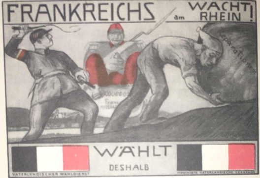
One cannot do what the Patriotic Election Service does in the poster “France on the Rhine.” One cannot tell the masses that they are idiots by depicting them as the German Michel with a nightcap. One can only do that if he does not want the sleepy target to do anything. If he does it anyway, he should be wearing the nightcap. The poster suggests no way to overcome the problems depicted, unless it thinks that their supporters should be seen in such a way. The poster artist displays an almost unbelievable ignorance of the laws of psychology. (Note the black-white-red stripes at the bottom. The Tricolor?).
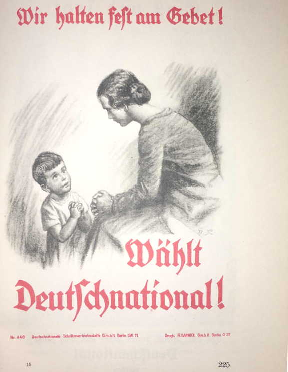
The two following posters, “We hold fast to prayer!” and “He who wants things as they once were must vote German National,” are also stupid.
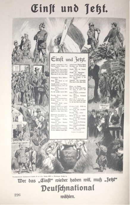
The second poster illustrates the attitude of a party that longs for the past and cannot look to the future to help build a new future. Particularly notable is the involuntary confession of its own backwardness: “He who wants things as they once were...”
The other poster is directed to a limited circle of people, probably smaller than the whole of the party’s supporters. To be thought pious has only limited value. Using this as an election battle call shows that the makers of such propaganda belong back in the time of the Crusades. Germany could not have been saved if one had sat with hands folded and done nothing, other than perhaps saying a prayer or reading the Bible, then went piously to vote for the German Nationals.
If these representatives of a religious political party have gone wrong (insofar as it would have been their duty to work actively for decency and faith rather than mouthing empty phrases), being several decades behind the times, the Center Party poster expresses the opposite. It has no justification at all, since its leaders should follow the commandment of the founder of their religious worldview and long for a kingdom that is not of this world. It might have been understandable if this party had campaigned against atheism and made the appropriate election propaganda, but it is entirely unclear as to what a Zeppelin has in common with the Center Party, other than perhaps the heaven that the Zeppelin climbs to while the Center Party increasingly turns away from it.
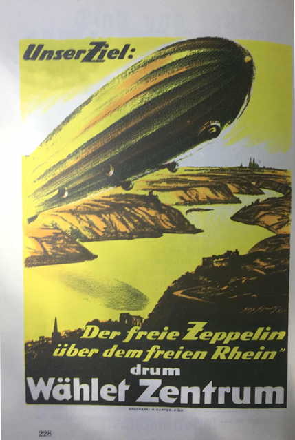
Only an attempt to be up-to-date, whatever the cost, leads the Center Party to use the Zeppelin as a method of propaganda.
The idea of using the popularity of the first post-war Zeppelins, built with the resources of the whole German people, was not bad, but it here takes a fully impossible form.
The poster “Hitler becomes Reich President” and “What does the wise man say” share the same intention and layout. In both cases a person is at the center and the text discusses him.
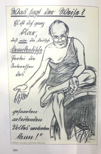
In the case of the Democratic Party, the wise Diogenes jabbers on his legendary barrel, sharing his wisdom with an admiring world. The logic of the Democratic text writer corresponds to the overall poster. It casts light on what the party leadership thinks of its supporters and those who might become such. It is not necessary to go into further details, since they follow from the discussion of the following NSDAP poster.
The poster “Hitler becomes Reich President” is typical of the powerful fighting propaganda of the NSDAP that excluded any opposition.

The Führer’s words “We are taking the fate of the nation in our hands,” combined with the picture display responsibility and strength. The changeable masses are drawn to determined leading personalities. Also, thinking people with responsible positions in business, etc., have more confidence in a determined, active man than in a weakling.
The firmness and determination shown in the poster also intimidates enemies. It weakens their confidence and raises doubts about the victory of their cause. The SPD leadership did in fact worry greatly about the effect of this poster on the masses. Unfortunately the poster has two weaknesses that reduces its effectiveness and may not, therefore, go unnoticed. First, the Führer’s hand in not lively enough, but rather looks posed. This, however, does not stand out too much.
The second error is significantly more serious: The election slogan “Hitler becomes Reich President!” (Emphasis on the first word.) I quote Hadamovski [Eugen Hadamovsky] here, who made this comment when evaluating this book: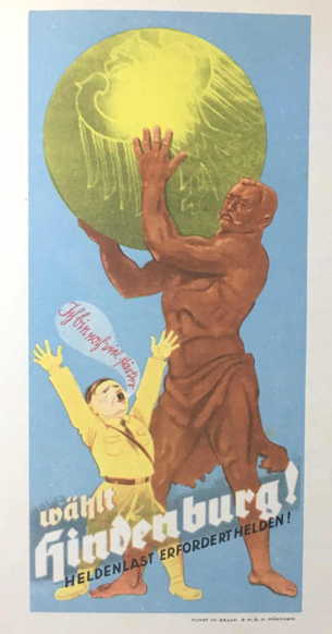
“I thought this phrase was a serious error in propaganda. Suggestion in propaganda must always depend on the content, not the slogan. When we used the slogan “Hitler becomes Reich President” in the 13 March presidential election, everyone interpreted it as saying Hitler would become Reich President and expected it would happen. On the evening of 13 March, everyone, including our own supporters, said: You tricked us, you aroused false hopes. You swindled us! A collapse in confidence is the worst result propaganda can have.”
The chant S.A. men used in the [Berlin] Sport Palace was much better: “Hitler should become Reich President!”
The text in the top half and the rest of the poster are in such agreement that it must be called perfect. One cannot determine the priority of text and illustration, for each determines the other. (Even if one knows that the illustration came first.)
Another poster from the Reich presidential election came from Hindenburg’s election committee.
It has the lovely title “Heroic burdens demand heroes.” It is a classic example of bourgeois “propaganda art.”
The artist Glaß depicted Hindenburg to us as Hercules. His inspiration for this outstanding work apparently came from reading Guidelines for Political Propaganda by SPD representative Dr. Mierendorff along with the previously mentioned Professor Tschachotin. Their recipe for effective political propaganda is “80% intimidation, 20% mockery.”
The poster displays little intimidation, but at least aims for 100% mockery, but backfires against the originator of this absurd and ineffective, but at least colorful, poster.
Unfortunately, I must mention another poster here that is indicative of the intellectual state of the SPD leadership at the end of 1932. With certain defeat before their eyes, these nervous trembling Jews were naturally unwilling to leave the political stage. The drawing reminds one of certain masterpieces of Bolshevist art from the provincial insane asylum school. I might not have mentioned this poster, since its propaganda effect is nonexistent. One should adopt a certain fairness when discussing political propaganda, else opposing views might have some effectiveness. One once again attempted to tear the mask from Hitler’s face, a senseless undertaking, rather like a dog who thinks he can impress others by howling for hours at the moon. In so doing, one unmasks himself! One shows the world what he really is: “the misbirth of filth and fire.” [This is a bit obscure, since there is no illustration]
Finally, we must discuss the falsification of posters. A favorite method of reducing the effectiveness of enemy posters was to put stickers over them or forge them so that they promoted one’s own party.
Stickers were the simplest method.
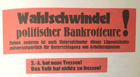
[The top one claims an election swindle, since the signers of the “lying poster” were responsible for oppressing the working class. The second translates: “The S.A. has new insignia! The people has nothing to eat!]
The texts were intended to arouse doubts about things said in the poster. As was true of the SPD’s other propaganda, their stickers were entirely ineffective. The form and content was such that anyone could immediately see that the statements did not rest on fact, but rather were simply fabricated.
Granted that it may sometimes be advantageous to have such a supply of stickers to attach in the event of really major betrayal, but these two do not appropriately fit on any poster.
The NSDAP also used this method in its battles, but in contrast to the SPD put only its most capable men for its propaganda, which had the corresponding success.
For example, it produced a sticker using a photograph showing such System dignitaries as Isidor Weiß, Grzesinski, Otto Braun, and others holding champagne glasses sitting at a well-stocked table. This was pasted on SPD posters that dared to present the same people as the leaders of a suffering and exploited people. The text of the sticker was: “Germans, judge for yourselves!”
This effective idea was also used by the KPD, but could not be applied in the same way. They used the lie and forgery of the “Kaiserhof bill,” which was very effective. [I think this was a presumably forged bill from the Hotel Kaiserhof, Hitler’s base of operations in Berlin before 1933 intended to suggest that Hitler was living luxuriously.]
A most effective NSDAP idea was a sticker with a call to court officials, bankruptcy attorneys, and similar occupations: “Vote for the SPD!”
Forging an entire poster was much more difficult. Sometimes one took an enemy poster and added new content. Aside from the cost, this took a lot of time and in the meanwhile the original poster had vanished from the streets. It thus lacked the timeliness of the original.
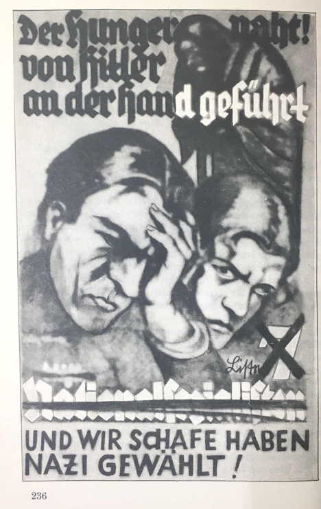
Things were different when stickering groups went through the streets at night, “transforming” appropriate posters on the poster pillars.
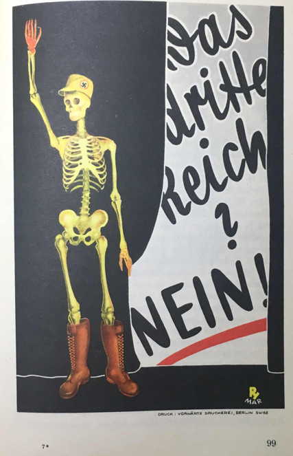
For example, the NSDAP had advance knowledge of the poster: “The Third Reich? No!” A sticker was hurriedly prepared that gave the skeleton a typical cap worn by Marxist bigwigs and a sticker with a large "Yes!” was prepared to fit over the “No!” When the SPD poster appeared on poster pillars and walls, it was not long before the Marxist poster had become National Socialist.
Finally, one should mention the painting of walls, fences, houses, curbs, sidewalks, etc.
The effectiveness of this “poster” propaganda consisted, as with banners, in the size of the space and the frequency of use. Linoleum tiles with Hitler’s face were attached to flat places. Given their clean, consistent appearance they had an excellent effect.
In conclusion, I want to provide one more example of the great difference between Marxist and National Socialist posters.
Thanks to their Jewish worldview and doctrines, the Marxist posters expressed a negative view of life. Logically, they had to resort to slander and lies, which ultimately do not work. The National Socialist worldview, on the other hand, affirms life and the Führer himself rejected methods that offended his sense of decency. The entire NSDAP followed this approach despite the intensity of the battle, never choosing disgusting means. That was possible because the Führer was never concerned about himself, but rather only the whole people. He and his loyal followers stood about such things and were thus morally superior from the beginning.
In the beginning was the idea, carried by and embodied in Adolf Hitler.
To transform the idea into action and to make it the worldview of every German, the people had to be made aware of it.
At the time the poster was the primary method of propaganda.
Propaganda had to be on a large scale to immediately make the right impression on the masses. The party did not want to show itself to the public as a brand-new party, but rather as an already existing large movement. This movement had to be brutal from the beginning. It displayed an outward greatness that alone can influence the people.
The people almost viewed Marxism as a fortress, victorious and unshakable. That was not changed by the many other lesser and greater parties that opposed it. The opposite. Their impotence reinforced that view of Marxism’s strong position.
History teaches us that in a battle between two equally strong peoples, the people with stronger and newer weapons wins. It is the same with domestic battles; winning requires not only the stronger worldview, but also brutal action. As Hitler put it: the propagandist “may not lack the force and astuteness to transmit his theoretical knowledge to the masses, to put it in a form suited to the receptivity of the broad masses, else all of his knowledge is visionary wisdom that could never become practical reality.”
The propagandist must be original, effective with the masses, and goal-oriented.
Thus the red color for posters, the union of the words “national” and “social,” the creation of symbols and flags, and finally, the fighting troops of the movement.
The poster alone could not transmit the new worldview.
At first the purpose of a poster is to attract people to meetings. That was the only goal propaganda had. At meetings the Führer could reach the masses, he could proclaim his worldview, he could put their suffering and sorrow into words. He proclaimed Marxism as the sole cause and promoter of all evil. This one-sided approach organized the fighting power of the masses. By revealing the enemy’s weaknesses and showing him not to be invulnerable as he perhaps had previously been thought to be, he gave the masses new ways of attack against the enemy. Even if all those at the meeting were not supporters of the new idea, they at least recognized that it was new.
Now the poster could take on a second major task, not only encouraging people to attend meetings, but also to stimulate their thinking.
That is why the NSDAP used only text posters in its early years. What could even the best illustration have accomplished if the people had no clear idea of the goals and aims of the party, or had at least a sense of them? A certain amount of educational propaganda was necessary at first.
That was why it was necessary to repeat constantly the basic truths.
It is almost incredible that long before the war, the Führer recognized the prerequisites for effective propaganda, that he saw the necessity of using them where they would help achieve victory.
There is almost nothing new in propaganda that the Führer did not somewhere express or apply.
For the propagandist, propaganda is not a matter of scientific research and investigation. The Führer has made its tasks clear enough. Its task is much more to make this knowledge one’s own and translate it into action.
War and propaganda destroyed the foundation of the Second Reich.
The fighting propaganda of the NSDAP helped to destroy the inorganic interim Reich that had been built on the ruins of the old collapsed world and replace it with the “eternal Third Reich.”
The propaganda of the Third Reich is called to lead each people’s comrade to the people’s community, to make it clear to him that his own well-being is intimately connected to the general welfare of the whole community, that all areas of life are inextricably connected to the great community of the people in the new state, that he may only serve its organs. He must assist in building the total state of the Third Reich.
Once the slogan was “Germany awake!” Now it is and forever must remain: “Germany, stay awake!”
Last edited 13 April 2026
Page copyright © 2017 by Randall L. Bytwerk. No unauthorized reproduction.
Go to 1933-1945 Page.
Go to the German Propaganda Archive Home Page.